

Let’s suppose you are an experienced proofreader and have extensive experience in book formatting and structuring. As you have professionally formatted different genres of books, you know the relevance and importance of book formatting before publishing. Having a strong command of book composition and organization, you thoroughly analyze the manuscript’s elements. It includes selecting typography, design, and layout of the manuscript. To ensure the legibility of both print-ready and e-book formats, you select an appropriate font and adjust the font sizes to make the content comprehensible. Adding captivating headings and subheadings in the chapters and sections maintains consistency and the logical flow. It helps readers learn about the plot, characters, the settings and comprehend the author’s voice and perspective. Introducing chapter breaks brings clarity to the paragraphs and creates a hierarchical structure. Adjusting indentation in new paragraphs or scene breaks improves the text’s readability.
The other significant part of manuscript formatting includes adding a title page that provides a clear introduction to the book. The headers with the book title, author’s name, and page numbers allow readers to navigate the book to know the genre and publishing details.
Beginner’s Guide to Book Formatting- Knowing about Common Formatting Errors
First-time authors who are enthusiastic about publishing their first book often do not focus on manuscript formatting and organization. They commit major formatting errors, resulting in a cluttered and unprofessional appearance in both the printed and e-book versions.
A noticeable common book formatting error is using different fonts throughout the sections of the manuscript. Inexperienced writers do not use one font style for the body text, headings, or subheadings, which confuses the reader. Moreover, extra spacing, insufficient margins, and alignment issues disrupt the flow of the text, making the book feel cramped. Typographic, design, and layout errors, inconsistency in page numbers, and inappropriate paragraph indentation give an unprofessional look to the manuscript. An unappealing book reduces content readability and increases disengagement. Additionally, it lowers the chances of attracting a publisher, decreases marketing efforts, and brings fewer sales.
Reading this blog helps you know the step-by-step platform-specific formatting guidance to structure your manuscript for both print and digital publishing. Implementing formatting guidelines enhances manuscript readability and ensures that the manuscript meets publishing Standards.
Understanding Book Formatting Basics
If you plan to write your book in MS Word, but lack knowledge of basic manuscript formatting. In such a case, you can hire professional publishing services for expert book formatting services. Experienced proofreaders and formatters collaborate in enhancing the interior design and exterior layout of the print and e-book. They begin by setting up your chapter headers and focus on inserting visual elements. It includes choosing consistent fonts, creating a right margin around the edges of the page, and appropriate line spacing, which makes text readable. Indented paragraphs with page breaks and eye-catching headings in the text improve readability. Adding page numbers to the header or footer allows readers to conveniently find various sections of the book. The experts pick out a simple and minimalistic color palette and texture that gives a mesmerizing reading experience.
To enrich the exterior design of the book, the formatters improve an enchanting book cover design with graphics and captivating illustrations that hook readers. Moreover, adding a compelling book blurb, a concise author bio, and other book details creates a strong, unique selling proposition that boosts book marketability. Thus, a properly designed and formatted print or e-book has high market visibility with increased sales and revenue.
Formatting Your Manuscript for Print
If you have a particular book size in mind and have decided to opt for the required print format. You need to know print formatting requirements. To make better publishing decisions, research potential publishers who assist you in opting for preferred book dimensions. Experienced publishers at David McKay Publications offer full-service publishing services such as professional book writing, editing, and book formatting and structuring. Once the book format is selected, the book designers begin by creating a visually appealing layout for the print manuscript. To choose the book dimension, first-time authors should set the document size based on the thickness of the book paper or a smaller trim size booklet.
The physical dimensions of the book, as measured by experts, is 6”x9. If you are planning to publish a short printed manuscript of about 200 to 350 pages, use mirror margins for the inside and outside of the book. If the images take up more space and reach the edge of the page, the print experts use an extra margin of design that is extended into the bleed area. They create crop marks on the printed sheet and trim off the extra space, making it a perfectly printed format with no white borders.
Regarding applying fonts and spacing, the typographers use legible fonts such as Serif, Times New Roman, Garamond, and Arial for print. They use a standard font size such as 12-point Times New Roman, or use similar font sizes for other fonts. To enhance content readability, printing professionals keep a consistent line spacing, such as employing 1.5 or 2.0 double spacing in the text. Consistency in chapter titles and headings in a print book implies the chapter titles are consistently placed at the top of the page, while subheadings are aligned to the left. The formatters use subheadings to break up lengthy text. Preferably, they choose a font that matches the book’s tone, and also a smaller font size than the chapter title but somewhat larger than the body text.
Insert page numbers and format their position. The authors use page breaks to separate chapters and sections. To split the continuous text into two pages, some writers leave a blank page on the left and start a new chapter from the right side. The formatters ensure that the headers and footer elements in both paperback and hardcover books, covering page number, book title, and chapter headings, are placed consistently across pages.
Formatting Your Manuscript for E-Books
The top-tier book writing services offer outstanding e-book formatting services. The design experts convert the manuscript into a professional, readable digital version that engrosses readers. They adjust e-book formatting elements that meet the Amazon publishing standards. The formatters create a re-flowable layout that ensures compatibility across Kindle, Nook, and other readers. The re-flowable text comprises a title page and table of contents, with page numbers and index formatting.
E-book formatters select a clear hierarchy and readable fonts such as Garamond or Georgia with an appropriate font size that is optimized for different screens. The other formatting aspects of EPUB or MOBI include proper line spacing, such as 1.5, and adding front and back matter in the manuscript. The e-book front matter includes a title page and copyright details. In the back matter, the expert e-book designers include the author page and the bibliography. The custom layout also comprises formatted illustrations with graphics and animation. Moreover, inserting external hyperlinks helps readers navigate the different sections of the e-book and read the preferred chapter. A professionally designed and formatted digital version with an aesthetically pleasing style, improved readability, and device compatibility attracts the targeted audience. The published manuscript reaches the global book market quickly through major publishing platforms, bringing high sales and ROI.
Professional Layout Tips
Maintaining consistency throughout the manuscript
Whether you are a first-time author or an experienced writer, you may encounter difficulty in creating a professional ebook layout. Professional e-book designers at David McKay Publications guide authors in maintaining consistency in different e-book layout components. The e-book professionals create a reflowable interface and select fonts and colors, whitespace, titles, subheadings, and other elements that are consistent and adaptable to different screen sizes. They assist e-book readers in employing a user-selected font setting to adjust the text and font size to make the content readable. Page numbers are required to be consistently placed, as it keeps book sections in sequence. Thus, the layout specialist should insert properly formatted headers and footers that give a professional look to the published manuscript.
Use Bold and Captivating Headings
A proficient layout expert uses different fonts for headings, subheadings, and body text to keep readers engaged with the text. They use larger text and readable fonts to create striking headings and subheadings to create a clear visual hierarchy and build positive engagement.
Using Templates vs. Custom Formatting
Another strategy employed by David McKay Publications is using predesigned layout templates. Design patterns are saved on Adobe and other design sites that assist designers in quickly creating content or design illustrations. Using cost-effective pre-designed structures saves time, money, and resources, and helps publishers to prepare a polished and well-designed e-book that reinforces e-book branding. Employing custom formatting allows e-book designers to express brand personality and values through visuals. They flexibly use custom designs to create unique visual styles, layouts, and formats that are specifically tailored to meet the needs and choices of the potential audience.
Tips for Handling Complex Elements, Footnotes, Tables, and Images
The design experts keep a simple, consistent font style and color patterns throughout the manuscript. They use standard formatting for tables, such as creating plain and uncluttered tables that can be easily comprehended. The illustrators insert compressed images in between the text. High-resolution pictures with adjustable dimensions are optimized for various screen sizes, varying from small e-readers to large displays. Regarding the strategic placement of footnotes, the formatters use standard footnote style and formatting. For an e-book, the footnotes are inserted at the bottom of the page, or an endnote is placed at the end of the book.
Avoid Overcomplicating Layouts and Using Too Many Fonts
To improve text readability, e-book publishers should avoid using too many fonts in the sections. Font overload creates a cluttered and confusing layout that distracts readers. Moreover, choosing inappropriate fonts, or overly wide or too narrow fonts, and low-resolution rendering make the text hard to read across different devices. For optimal readability, the formatters should stick to the fonts that readers find comfortable for reading. The commonly used standard fonts like Georgia or Arial, or Times Roman are tested on multiple devices, and are considered text reader-friendly.
Widows, Orphans & Section Breaks: Common Print Issues
Widow and orphan page breaks are printing errors that occur when the widow, the last line of a paragraph, appears at the beginning of a page, and the orphan, the first line of a paragraph, comes at the bottom of a page. An inappropriate placement of the text creates unprofessional page breaks and disrupts the reading flow. To prevent an uneven visual gap, the publishing experts should remove irrelevant manual page breaks by showing formatting marks. Extra paragraph marks should be detached from the printed book. Use the proper insert page break command for new pages and adjust margins and scaling.
Testing Your Formatted Book
Print Preview and Readability
To help new publishers learn how to publish a well-structured, cohesive manuscript implies that professional publishers conduct the final check of the printed book. They create a printed copy to check minor and complicated printing issues. A print preview helps authors and publishers to look for irregular spacing in the text. While evaluating, they must ensure that the paragraph, line, and image spacing are consistent throughout the book. To fix the font errors, the formatters place the fonts uniformly. Correcting the page numbers, the professionals ensure that the page numbers are marked correctly and are positioned in sequence. Next, formatters check misalignment, unsuitable margins, and other visual problems that may not be apparent in the digital file. At the end of print preview, the publishers evaluate the overall layout quality, the ink and paper quality, and the lucidity of the text and images on the selected printed paper.
E-Book Preview
For e-book formatting preview, the publishing team reviews the file using different formatting tools such as Adobe InDesign. The book formatting software creates a digital file that highlights major and trivial publishing glitches. E-book publishers check font placement and line spacing within the paragraphs. While analyzing page and section breaks, they ensure that page breaks come at the end of each chapter. Some publishers leave a page blank and begin the new chapter on the right page. Disorganized page breaks create a mess and are confusing for the readers. Checking headers and footers allows formatters to add page numbers, chapter titles, fonts, and layout designs correctly on the pages.
Testing on Multiple Devices (Kindle, Tablets, Phones)
The publishers also test the e-book file on different devices, such as Kindle, tablet, and smartphone, to examine whether the formatted e-book version is optimized for different screen sizes and resolutions.
Getting Feedback from Beta Readers and Proofreaders
A constructive response received from beta readers and proofreaders helps publishers to refine the quality of the text and enhance the structure and organization of the print and digital versions. Beta readers provide feedback on the narrative, such as the strengths and loopholes in the plot, settings, themes, character development, and story pacing. Potential readers’ feedback helps publishers know their target audience’s preferences, reading choices, and their expectations of the author. Depending on the recommendation, the authors hone their writing style and add comprehensible vocabulary, and improve the structure of the book. The proofreaders find grammatical punctuation, typos, and formatting flaws and develop an artistic masterpiece that brings an enthralling reading experience.
Choosing the Right Tools and Software
Word processors: MS Word, Google Docs – pros and cons
Professional book writing services use various e-book formatting tools and software for consistent formatting, design, and structure of manuscripts. The most common software used by formatters is Microsoft Word. The authors use word processors, including Google Docs, for writing, organizing, and formatting books of different genres. Whether the e-book publisher plans to format a fiction, memoir, or non-fiction book into a PDF or an EPUB file, a word processor automatically converts MS Word documents into the required file format.
Another key feature is that the publishers and formatters have access to Word’s wide-ranging template library. They format and organize large documents with ease. If a publishing house intends to outsource the manuscript formatting task to another book publishing agency or hire a formatter.In such a case, they use a powerful publishing tool that offers robust file sharing. Google Docs’ cloud-driven software ensures robust and synchronous file sharing. Data can be securely accessed across different devices and locations.
Professional Formatting and Publishing Tools for Mac users
If you are searching for editing and formatting tools that create striking layout designs with varying fonts, typesetting, and formatting features, you have the option of using Mac-exclusive ebook formatting software. It includes Vellum, Adobe InDesign, and Scrivener.
Vellum comprises formatting features that extract the file in EPUB and automatically format PDFs for print books. The authors and publishers have easy access to download and begin using Vellum for free. However, the publishers who use Vellium to export an ebook are required to pay the premium amount of $199.99 to $249.99 for unrestricted ebook exports.
Adobe InDesign is the most advanced design software that allows publishers to control the entire book layout design for print and digital formats. The software seamlessly combines with Adobe Photoshop, Illustrator, and Acrobat to add graphics to layout designs. The publishers add professional design features, styles, typography, and the pagination design pattern to create a well-designed and elegant e-book and print version.
Scrivener assists writers and publishers with writing and organization of manuscripts. The formatting feature involves compilation and extraction of files in all types of formats, such as PDF, EPUB, and MOBI. The formatting tool facilitates publishers with basic text formatting such as adjusting font size, styles, color, typography, indentation, and handling the overall structure of both printed and e-book manuscripts. Using Scrivener benefits publishers, allowing them to avail a subscription by paying a one-time license fee to operate the software.
Software for E-Books
E-book formatters use Amazon KDP Kindle Create to refine the text, images, and the structure of the e-book. The software converts the file into KPF and EPUB for Amazon Kindle Direct Publishing. Kindle Create offers pre-designed themes, an automatic table of contents, a reflowable layout, and a print layout. Accessing these key features helps publishers to flexibly extract the required file and adjust the fonts, page alignment, spacing, paragraph indents, page numbers, scene separators, and insert high-resolution images in the file. Once the file is finally prepared for publishing, the formatters export the file for Kindle ebooks or print books as required.
Recapitulate
Let’ suppose you are managing a startup publishing firm, you intend to create a professional, well-designed, and structured manuscript that hooks readers. In such a case, you are required to hire professional book formatting services that give a professional and refined look to the manuscript. Professional formatters streamline the production process by reviewing manuscripts’ design, layout, and overall formatting for both print and digital platforms. The publishers adhere to strict formatting guidelines and ensure that the manuscript meets the specific print and digital publishing standards. Experienced book designers analyze the manuscript in depth. It includes arranging text, embedding font sizes, appropriate line spacing, margins, and accurate placement of headers and footers, and page numbers. Inserting captivating images into a readable and aesthetically pleasing layout generates a cohesive published version. As the formatter receives the final proofread manuscript from the publisher, they upload the file into publishing software such as Adobe InDesign. It creates both digital and print files to inspect file specifics before final publishing. The print and digital review highlights visual issues comprising inconsistent margins and spacing, font errors, and irregular page numbering. Moreover, it offers market feedback and proofreaders’ responses that help publishers to elevate the manuscript quality before its official release. Using specialized software for manuscript structuring prevents file rejections as it professionally compiles and exports files to both print and published formats.
An artistically designed and formatted book increases discoverability and strengthens brand identity in a crowded publishing market. An increased marketability promotes the published and printed versions on online platforms that attract a wider audience and bring high sales. For readers, a professionally crafted and technically formatted manuscript increases readability and offers an immersive reading experience. The digital version, comprising e-books and other digital formats, is accessible to the potential audience through e-reader devices. The customizable features offer versatility and boost engagement.
YOU MIGHT ALSO LIKE
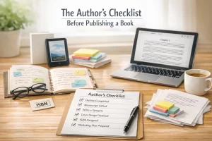
The Author’s Checklist Before Publishing a Book
If you are a first-time author who aspires to bring out your first publication in the market, you should be

How to Become a Bestselling Book Publisher with Amazon Publishing
Let’s suppose you are an independent publisher with a zero brand presence; you must be planning to adopt a strategic

Your First Book Deserves Better: How to Choose the Right Self-Publishing Service
I. Introduction: Why Your First Publishing Decision Matters Finishing your first book feels amazing. There’s relief. Pride. A little disbelief.